


CARLA LEAL TERAPEUTA INTEGRATIVA / Identidade Visual / 2022
________________________________________
CARLA LEAL INTEGRATIVE THERAPIST / Visual Identity / 2022
Carla Leal proporciona atendimentos individualizados, de qualidade com amor, respeito, dedicação através de um contato pessoal ou online, utilizando técnicas e terapias integrativas como um tratamento complementar para doenças e males físicos, mentais e psicológicos.
As terapias integrativas são opções de tratamento complementar para vários tipos de doenças. Por falta de conhecimento, ainda existe um estereótipo de que tais métodos sejam práticas místicas.
O nosso propósito foi de criar uma marca que quebre com essa objeção, através de elementos que transmitam um conceito de transformação, concebendo uma marca pessoal humana e sensível ao público.
EN _________________________________
Carla Leal provides individualized, quality care with love, respect, dedication through personal contact or online, using integrative techniques and therapies as a complementary treatment for physical, mental and psychological illnesses and ailments.
Integrative therapies are complementary treatment options for various types of illnesses. Due to lack of knowledge, there is still a stereotype that such methods are mystical practices.
Our purpose was to create a brand that breaks with this objection, through elements that convey a concept of transformation, conceiving a personal brand that is human and sensitive to the public.
Observamos que no meio terapêutico integrativo, a comunicação é bastante informativa para difundir conhecimento sobre o assunto, utilizando elementos visuais ligados à natureza, equilíbrio, formas geométricas, figuras humanas e símbolos espirituais.
Interpretamos que um caminho possível para que o logotipo representasse um conceito de transformação, equilíbrio e energia, seria a utilização de figuras ou elementos humanos, tendo assim uma conexão profunda com o seu público.
EN _________________________________
We observed that in the integrative therapeutic environment, communication is quite informative to disseminate knowledge on the subject, using visual elements linked to nature, balance, geometric shapes, human figures and spiritual symbols.
We understand that a possible way for the logo to represent a concept of transformation, balance and energy would be the use of human figures or elements, thus having a deep connection with its audience.


Para o símbolo, utilizamos duas figuras humanas, que representam a mudança de um estado de dor ( representado pela figura humana que tem a cabeça olhando para baixo ) para um estado de bem-estar, ( representado pela figura humana que tem a cabeça elevada). Queremos expressar justamente a transformação proposta pelas terapias integrativas, transitando de uma figura para a outra, no sentido da leitura da esquerda para a direita, e de baixo para cima.
EN _________________________________
For the symbol, we used two human figures, which represent the change from a state of pain (represented by the human figure with the head looking down) to a state of well-being (represented by the human figure with the head raised) . We want to express precisely the transformation proposed by integrative therapies, moving from one figure to the other, in the sense of reading from left to right, and from bottom to top.

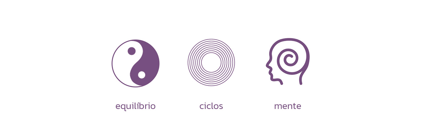
As figuras humanas também trazem a identificação com o público, como se cada um se colocasse no lugar delas. Ao centro das duas figuras, utilizamos o símbolo do Yin Yang, que representam a união de suas energias opostas, o positivo e o negativo, reforçando a ideia de equilíbrio. O Yin é centrípeto, enquanto o Yang é centrífugo, e portanto ambos geram energia, palavra-chave do nosso conceito. As formas circulares ou semicirculares da marca, tão presentes na natureza, são as mais orgânicas e representam segurança, proteção, confiança e fé. Círculos e globos nos fazem lembrar do sol e da lua, e, graças a isto, eles geralmente são usados para simbolizar o ciclo da vida e as mudanças de estações. O logotipo foi construído dentro de uma matriz de proporção áurea, promovendo harmonia.
EN _________________________________
The human figures also bring identification with the audience, as if each one were putting themselves in their place. In the center of the two figures, we use the symbol of the Yin Yang, which represent the union of their opposite energies, the positive and the negative, reinforcing the idea of balance. Yin is centripetal, while Yang is centrifugal, and therefore both generate energy, the keyword of our concept. The brand's circular or semicircular shapes, so present in nature, are the most organic and represent safety, protection, trust and faith. Circles and globes remind us of the sun and moon, and thanks to this, they are often used to symbolize the cycle of life and the changing seasons. The logo was built within a golden ratio matrix, promoting harmony.


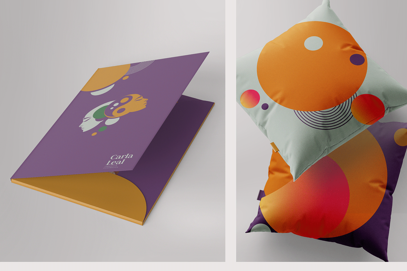
Para definir as cores apontamos paletas com tons naturais e vibrantes. Utilizamos as cores cinza, verde, laranja e roxo. Nesta paleta estabelecemos a predominância do Roxo como cor principal, seguido pelo laranja, assim criando uma hierarquia de cores, completadas pelo cinza e verde.
Para o padrão tipográfico escolhemos a Judson por se tratar de uma tipografia sóbria, tradicional e ao mesmo tempo com atributos e acabamentos modernos, conferindo um status de autoridade para o logotipo. Aplicamos o nome em caixa baixa remetendo proximidade e empatia.
EN _________________________________
To define the colors, we point out palettes with natural and vibrant tones. We used the colors gray, green, orange and purple. In this palette we established the predominance of Purple as the main color, followed by orange, thus creating a hierarchy of colors, completed by gray and green.
For the typographic pattern we chose Judson because it is a sober, traditional typography and at the same time with modern attributes and finishes, giving the logo an authority status. We apply the name in lowercase, referring proximity and empathy.


Através do avanço da tecnologia, rotinas de trabalho, excesso de informações e da influência da vida moderna, a sociedade tem desenvolvido cada vez mais vulnerabilidade e aquisição de doenças do trato mental, psicológico e físico. Neste cenário, entendemos que atuação de terapeuta integrativa de Carla Leal é cada vez mais necessária como agente de transformação e cura.
Para tanto, era preciso criar uma relação entre a marca e seu público, através de uma ideia, um conceito e uma personalidade que foram desenvolvidos neste projeto.
EN _________________________________
Through the advancement of technology, work routines, information overload and the influence of modern life, society has increasingly developed vulnerability and acquisition of mental, psychological and physical diseases. In this scenario, we understand that Carla Leal's role as an integrative therapist is increasingly necessary as an agent of transformation and healing.
To do so, it was necessary to create a relationship between the brand and its public, through an idea, a concept and a personality that were developed in this project.


